Fonts
Headlines
Sofia Pro Medium | All caps, extra tracking (100) A B C D E F G
Body Copy
Sofia Pro Light | Sentence case, extra tracking (25) Aa Bb Cc Dd Ee Ff Gg
Body Copy Callouts
Sofia Pro Light Italic | Sentence case, extra tracking (25) Aa Bb Cc Dd Ee Ff Gg
Font Substitution
Sofia Pro is available for purchase from MyFonts.com or Adobe Fonts (included with most Adobe Creative Cloud plans). If you cannot obtain a license for Sofia Pro, Century Gothic is available on many PCs, and can work as a reasonable substitute.
Font Legibility
Remember, it doesn't matter what the copy says if it isn't legible. Use 11 point font size as a default. Our audiences include patients with low vision, and older adults. To improve legibility, use white space to provide relief. Generous margins help. Add extra tracking (100 for headlines; 25 for body copy) and extra leading for body copy (11/17; 10/16; and never less than 8.5/14). Avoid bold typefaces in body copy to keep apertures open and characters distinguishable.
Typeface adjustments may be needed for legibility in certain platforms or contexts, such as billboards and video. In these scenarios, you may substitute Sofia Pro Light with a stronger Sofia Pro typeface.
Headline Treatments


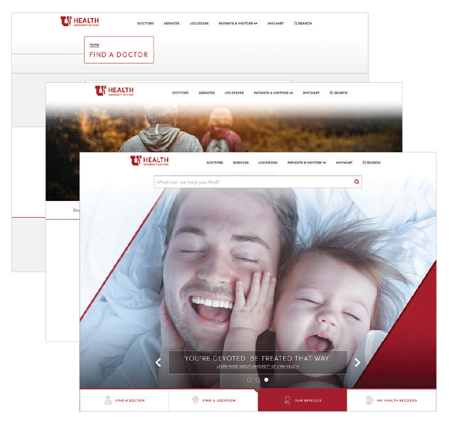
The headline treatment for this brand is bold, confident, and clean. Headlines should always be set in all-caps. Depending on the size, use either Sofia Pro Light or Sofia Pro Regular. To highlight certain words visually, use a Sofia font that is two grades bolder. For Sofia Pro Light, use Sofia Pro Medium for emphasis. For Sofia Pro regular, use Sofia Pro Semi Bold for emphasis. You can indent the last word in the headline to give emphasis to the headline, as well as a feeling of forward movement. Headlines should be typeset in 90% gray; white when necessary, such as when used on top of a photograph; and rarely in red.
Body Copy


Body copy is always set to 90% gray, never black. Placing body copy on the U of U Health gradient allows it to pop off the page and remain legible, without sitting on stark white. While body copy should never be red, sub headlines and compartmentalized content may be.
Brand Colors
University Core Colors
Utah Red
Utah Red Coated formula R8940
Utah Red Uncoated formula R8939
CMYK = 0/100/79/20
RGB = 190-0-0
HEX = #BE0000
University red is the primary color in the U of U Health brand. Using it further reinforces the overall University of Utah brand, and helps us stand out to a worldwide audience.
Black
SPOT = Black
CMYK = 0/0/0/100
RGB = 0-0-0
HEX = #000000
We often use 90% black.
Black adds depth and nuance to the U of U Health brand. We actually use 90% grey rather than solid black. Use this for both graphics and typography—including headlines and body copy.
White
SPOT = White
CMYK = 0/0/0/0
RGB = 255-255-255
HEX = #FFFFFF
White is an important background color to help content pop and be legible. It provides a canvas to bring our rich, vivid, human-centric photography and messages to life.
Using Core Colors
Core colors are standard for majority of communications for use in U of U Health:
- Advertising
- Marketing
- Outreach
Accent Colors: grays
GRANITE PEAK
SPOT = PMS 7544
CMYK = 52/26/26/16
RGB = 117-142-153
HEX = #708E99
50% GRAY
CMYK = 0/0/0/50
RGB = 147-149-152
HEX = #939598
SALT FLAT GRAY
SPOT = PMS 7541
CMYK = 10/5/7/0
RGB = 226-230-230
HEX = #E2E6E6
GRADIENT
15% black fading to white
Accent Colors: cool
LAKE POWELL
SPOT = PMS 5483
CMYK = 65/11/25/27
RGB = 79-134-142
HEX = #4F868E
GREAT SALT LAKE
SPOT = PMS 325
CMYK = 67/0/29/0
RGB = 58-191-192
HEX = #3ABFC0
BLUE TOPAZ
SPOT = PMS 7471
CMYK = 37/0/17/0
RGB = 157-216-215
HEX = #9DD8D7
MOUNTAIN GREEN
SPOT = PMS 360
CMYK = 63/0/84/0
RGB = 108-194-74
HEX = #6CC24A
Accent Colors: warm
WASATCH SUNRISE
SPOT = PMS 1235
CMYK = 0/32/94/0
RGB = 255-184-29
HEX = #FFB81D
ASPEN YELLOW
SPOT = PMS 123
CMYK = 0/16/89/0
RGB = 239-192-65
HEX = #EFC041
CORAL PINK SAND DUNES
SPOT = PMS 486
CMYK = 0/50/42/0
RGB = 228-147-123
HEX = #E4937B
RED ROCKS
SPOT = PMS 202
CMYK = 0/100/89/50
RGB = 130-0-0
HEX = #890000
Using Accent Colors
Primary and accent colors may be used minimally where appropriate. They are not to usurp the core palette, but are used to:
- Have consistent charts & graphs
- Unify infographics
- Enhance unique needs (t-shirts, races and events, seasonal events)
- Enhance publications and consumer content