
Why Our Logo Matters
Our logo is the flag we fly over all the exceptional work we do. This guide will help you use the logo correctly and consistently so that your unit both enjoys and contributes to the excellent reputation of University of Utah Health.
When you use the logo—fly the flag as it were—you instantly establish familiarity and credibility with your audience. You evoke the positive attributes that distinguish us.
What are these attributes?
Market research tells us that our patients and the public recognize us as health and science’s best and brightest, collaborating to provide leading edge treatments, train tomorrow’s specialists and expand our understanding of health and disease. They know us for our deep and broad health care expertise.
Engage your audience’s high regard for University of Utah Health. Use the logo in all your communications.

Use the full logo always. Use of the "U helix" by itself is restricted. The logo should be applied in solid University red. Where necessary, you may use the logo in 90% black or solid white.
Clear Space
Do not congest the logo. Give it ample room to breathe—more than what is shown adjacent. In digital interfaces and other small-space contexts, content and service lines must be at least two serif heights away from the logo. Never place the logo on the edge of a margin or perimeter. Use a minimum of at least one serif height.

Logo System
University of Utah Health shares a common visual identity—our master-brand. As an integrated academic health system, we must demonstrate lifelong partnership to our audiences, no matter where or how they interact with us.
Additional logos reinforce the master-brand, yet suit the unique needs of the schools and colleges, the library, and U of U Health Plans.
Colleges & Schools
Collegiate logos are used for non-clinical communications. This is important for student recruitment and for reaching alumni and donors who may work for competitors, yet have affinity for their alma mater.
U Health Plans
Health Plans is a separate non-profit entity of the university that provides insurance for businesses who are seeking coverage for their employees.
All brand standards apply to the schools and colleges, the library, and Health Plans. When two or more of these entities are doing joint communications, they should roll up to the masterbrand to reinforce that we are one system. Requests for approval or use of these logos can be sent to brand@hsc.utah.edu.

Service Lines
Services, clinics, labs, departments, and programs do not have unique logos. Rather, your service line is identified outside of the logo field to provide greater versatility and prominence. Effective communications will leave your audience with a clear understanding of your college, department, program, etc. and the message that you have to convey. Use the logo to endorse your communication.
Service lines are typeset in Sofia Pro. Use Title Case in body copy and addresses, as shown in the stationery samples. Use ALL CAPS in Sofia Pro Medium when service lines are prominently displayed on the cover of collateral; on apparel; or on premiums such as water bottles or totes.
Samples of Service Lines in Use
Business Cards, Letterhead, and Envelopes
It is easy to order these materials through a simple turnkey process with University Print and Mail Services. Contact them at 801-581-6171 or visit printing.utah.edu to see samples and order online. For your convenience, electronic letterhead may also be ordered through University Print and Mail Services.


Service Line Identification - Premiums
It is possible to order logo items that also have a service line (Department of Psychiatry, Dermatology, Facilities & Engineering, etc.) when people order material with two imprint areas ensuring service line names/second imprints are approved before contacting a vendor.
Required-Two imprint areas:
- Area 1: the full University of Utah Health logo (not just the “U helix”)
- Area 2: the service line typeset in Sofia Pro Medium, ALL CAPS, in University red (standard), or white or 90% black where necessary
Use of the "U helix" is limited, as seen on caps, badge clips and other small items. Email brand@hsc.utah.edu in advance to request permission. When authorized, the U helix will stand alone without any other text or logos.

Apparel
- Service lines are typeset ALL CAPS in Sofia Pro Medium.
- Service lines are typeset in University red (standard), or white or 90% black where necessary.
- Type height not to exceed: 21pt. tall, 24 leading, letter-spaced at 75pt (24pt for 7 letters or less)
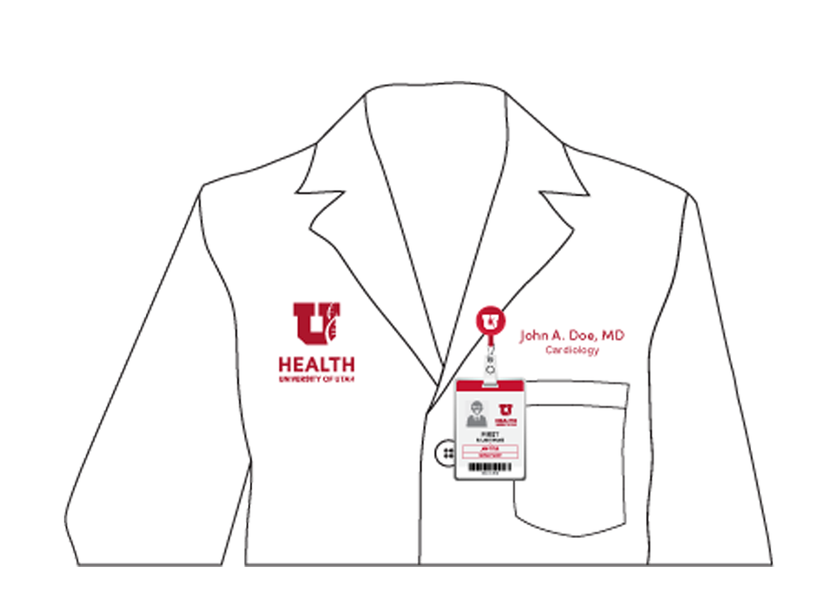
WHITE COATS: are ordered through the campus store.
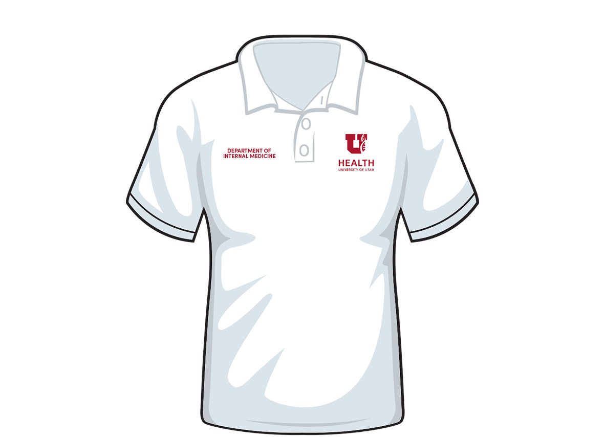
STANDARD: service lines are placed on the right chest, opposite the logo.
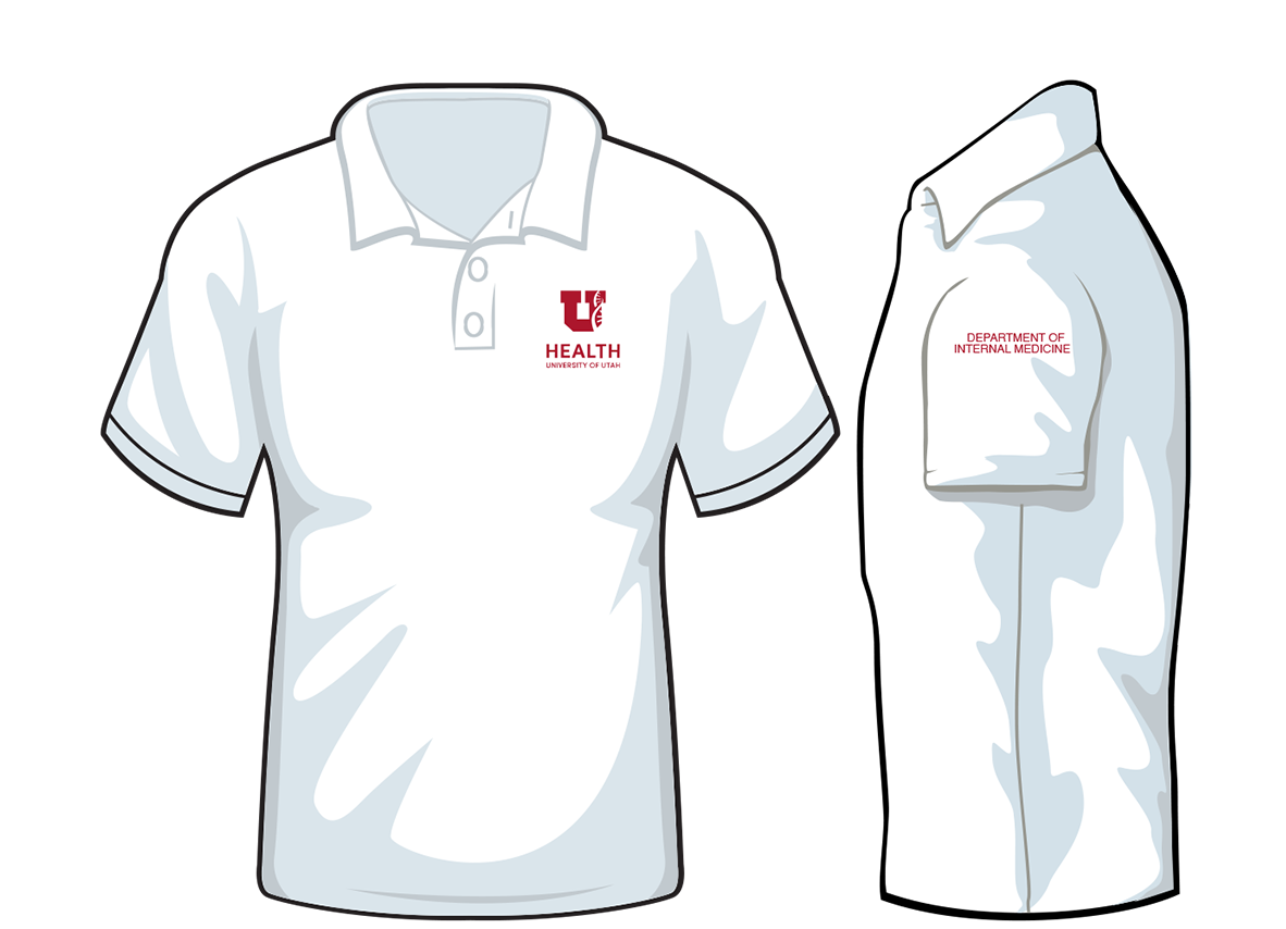
ALTERNATIVE: service lines may be placed on either sleeve
Unacceptable Alterations
The logo is a unique piece of artwork and should be reproduced consistently. Incorrect uses of the logo are shown below.
The logo consists of two elements: the U helix and the logotype. These elements must be retained in their fixed relationship to one another.
The logo may never be altered in shape or proportion.
Do Not

Change the logo color or typeface.

Stretch the width or height proportions.

Violate clear-space requirements, or add text into the logo area.

Use the U helix to create a new logo.

Alter the logo elements.

Alter the size relationships between the graphic elements.

Add dimensional effects, such as bevel, emboss, or glow.

Dismember and recombine logo elements.
Wordmarks
A wordmark is a typographical design for a written name that is used to identify select U of U Health products. A word mark is not a logo.
From time to time, wordmarks are authorized for use on platforms, such as MyChart and HealthFeed; select events, such as Leadership Development Institute and Well You; and for select initiatives, such as Virtual Visits, Imagine Perfect Care, 3i, or Connect2Health.
Wordmarks are not provided for the following: Clinical services, clinics, labs, departments/divisions, programs, individual research studies, or business units.
Wordmarks never appear alone or as a substitute for the logo. Wordmarks always accompany the logo and adhere to clear-space standards. Wordmarks use Sofia Pro Medium for emphasis but may also incorporate Sofia Pro Light—in 50 percent gray—for visual contrast.
All wordmarks are considered by Brand Governance on a case-by-case basis to prevent proliferation. To request consideration of a wordmark, please email brand@hsc.utah.edu.
Special consideration for multi-institutional research: When U of U Health is a participant in larger, national or multi-institutional studies that are already branded, they may use co-branding to promote study participation or awareness. When the promotion is intended to garner study participation, they may use a reasonable URL on promotional materials, including swag. URLs do not appear on apparel.
Example Wordmarks

|

|

|

|

|

|

|

|